 In a world where we are overwhelmed with data and metrics and key performance indicators and reports and dashboards and. . . sometimes all it takes to make some sense of all this "mess" is someone stepping up to share a tiny slice of wisdom from their experience.
That's my plan for this blog post. To share with you three custom reports that I find to be super valuable when I am doing web data analysis. Not only will I tell you about them, I'll give you downloadable links so you can get going right away!
I must forewarn you that my hidden agenda is also to expose to you metrics you might not be using, views of data that you might be ignoring, best practices that are of value and teach you how to fish. Consider yourself fully forewarned!
I love custom reports. They allow us to step away from the oppression of standard reports (/data pukes) and bring an increased amount of relevancy, calm and focus to our day-to-day work and to our beloved data consumers.
If your daily practice of web analysis does not hugely rely on custom reports (andadvanced segments) then I am afraid you might be a lot more in the Reporting Squirrel mold and a lot less in the Analysis Ninja mold. Sorry.
With that motivational speech, :), below are three custom reports that are of incredible value. You can use them as is, or, better still, you can download and adapt them to your unique business needs. Either way I promise you'll deliver actionable insights faster!
[While I am using Google Analytics here, you can do custom reporting in pretty much any tool you have access to, be it Yahoo! Web Analytics or Site Catalyst or WebTrends.]
#1: Page Efficiency Analysis Report.
I am often irritated by how fractured page level reporting is. Four or six or ten reports that all tell you how your website pages are doing, except that you don't know which report to use and what the heck to do. So you, and I, do nothing. Faith rules.
My goal was to create one single report for you that would serve as a valuable starting point for page analysis for any type of website, especially a content rich non-ecommerce website. Here it is. . .

Optimally, to judge a page you'll look at three different pieces which are often not on the same report or not in any standard report. We fix that above.
First, what we want to know is: How often does this page act as our home page (Entrances) and how well is it doing its job (Bounces)?
I like reporting by Page Title (hopefully you are good at SEO and have taken care of this). I can quickly see which pages have high/horrible bounce rates. In an instant I know which pages need emergency surgery.
[For the minority of you who believe high bounce rates are ok, I encourage you to see this post: http://zqi.me/akbounce I especially recommend reading comments #153, #157 & #164. Thanks.]
Second, we worry about content consumption: How many Unique Visitors came, how many page views were generated and what content was more consumed more / less?
A lot of focus is on measuring Visits, which in this case I don't find to be of any value. I want to know how many People (approximated by Unique Visitors, plus or minus a few) saw a piece of content. Pageviews gives me a great proxy for knowing how often they might have seen it (not surprisingly more than once for my looooooong blog posts!).
The final metric in this bucket – and this is lovely – focuses on which pieces of content are really consumed. I write really long posts; it is gratifying that people spend 14 minutes reading one, but I can also easily see posts/topics people just skip (not good!).
Super awesome right?
Third, (the part almost everyone ignores), "show me the money!!!!": What value was created by the content for our business? And by business I also mean non-profit, university, newspaper, government websites and chicken farmers!
I don't care about page views if I am not making money / adding value to my non-profit or university. The data in the last two columns shows-pay attention please-differences in value created (for you!) when that piece of content was consumed.
Per visit goal value column shows ultimately how much a page might have influenced impact on your business during a visit where someone viewed that page. So People who see Page 2 end up creating 0.82 value for you, and People who see Page 3 end up creating $1.15 worth of value. Hence content on Page #3 was more valuable to your users and your business during this time period.
I like having Total Goal Completions because sometimes raw $ value hides insights. For example see pages #3 and #4. See what I mean?
Initial job greatness, consumption / "engagement", and value delivered to your business. Do you know this about your content?
Here's how you can get this report:
- Log into Google Analytics.
- Come back here.
- Now click on this link Page Efficiency Analysis Report. It will open in Google Analytics.
- Click on the Create Report button and it will save it in your account.
If you want to share this report with others (say via Twitter / email) you can use this url: http://zqi.me/akpage
Bonus Items:
You'll note that I have pre-built two drill downs into this report. If you click on the Page Title you'll see Visitor Type (New vs. Returning). I like to see for my great / awful pages if the behavior and data differs for those two segments. Then I like to drill down by City, again to see deltas. But you can change this to anything you want.
Remember you can apply segmentation (oh yesss!) to this report. Scroll all the way to the top of the report. Click the drop down next to Advanced Segments. Click on Mobile Traffic (or whatever) and. . . Boom! Mobile page efficiency analysis! Sweetness.
If you have an Ecommerce website you can replace Per Visit Goal Value with Per Visit Value and Total Goal Completions with Transactions.
If seven metrics seem to be too much to analyze click on the Comparison icon on top of the table (in Google Analytics) and you'll magically get this:

An easy peasy fast way to compare two metrics of most value to you and quickly identify the winners and losers. In this case I am answering a common question: Which content is consumed the most by People on my site and of that content which is most "engaging," i.e. cause them to read all of it?
Play with this feature; it is to die for. Change the pairings. Faster insights, guaranteed.
#2: Visitor Acquisition Efficiency Analysis Report.
We tend to be far too obsessed about Search Engines and Twitter and the Next Shiny Object.
Or we are organized by silos. Daniel's responsible for email and Gemma's responsible for Bing and Harun's responsible for display. They never talk (there is no incentive to). There are a ton of reports of course. But everyone's optimizing for their local maxima rather than for the global maxima.
Hate that.
My goal was to create one report where I can review the efficiency and performance across all streams of traffic to the site. Paid media (PPC, Display etc), Earned media(Social Media), and Free media (SEO, Referring Sites etc). I don't want the Next Shiny Object nor the Current HiPPO Obsession to drive our acquisition strategy.
Here's the report that is a fabulous starting point. . .

Let's break down a report you are soon not going to want to live without. :)
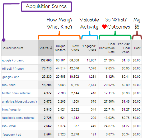
First, it shows all traffic sources. This is key. Organic and paid search, direct traffic, Twitter and Facebook, Facebook display ads, email marketing, top referring sites etc etc. No more silos! One place to judge how all streams perform. No egos.
Second, we focus on input metrics: How many sessions (Visits) by how many Unique Visitors and how many existing vs. new?
Senior folks seem to love Visits; I find them harmless. I really care about People. So one column for each of us. Are your marketing dollars chasing visits from people who have already visited your site, rather than prospects? New Visits to the rescue. For example notice the delta between Facebook ads vs. Facebook referrals. Ouch. Cute to know this key performance metric, right?
Third, this one's really important: How many people engage in behavior we value?
Typically you would look at metrics like Average Time on Site or Page Views per Visit. In this context why not use something significantly more insightful? I have created a Goal for the site where anyone who spends more than x amount of time or sees more than y number of pages is really giving me a precious gift: their attention. Regardless of whether they buy or submit a lead or do anything else of value, for me it's success.
Looking at this Goal, rather than Avg Time on Page, is significantly more insightful in judging the initial blush of success. You see even if these people don't buy on the website they might buy offline. Or even if they don't donate or download, they'll at least be much better aware of my brand. Or even if my acquisition campaign (Paid, Earned or Free) did not result in conversion in this visit, maybe they'll come back later.
Use this type of clever behavioral goal measurement rather than Avg Time / Pages.
[Important: When you download this report, below, this column might have a zero or show something incorrect - if you have Goal 6 defined. To use the smart strategy I am recommending you'll have to 1. work with your business leaders to identify what "engaged" behavior is in your case is, 2. create a goal for it and then 3. add that to the report you'll download here, then 4. celebrate.]
Fourth, outcomes baby! How much business value was added.
I don't have to teach you the value of using Conversion Rates and Goal Values. The whole point of this report is to prioritize our focus.
A vein should have popped in your head when you saw the conversion rates between google/cpc and google/organic. Good lord!
You can quantify that your Twitter earned media efforts yield 21 cents of extra value for every visit when compared to Facebook earned media efforts, and a shocking 62 centsmore than your efforts with Facebook display ads! OMG.
Will that help you prioritize your efforts better? As Sarah would say: You betcha!
Fifth, this is very important: What did it cost you to get this traffic to your site?
This column in the report will often be zero. If your AdWords account is linked to Google Analytics perhaps you'll see Cost here. But most of the time it will be zero.
I still want you to have it.
Just to remind yourself, and your decision makers, that not all these rows have the same cost to bring that traffic to your site, to get it to engage and finally deliver the value you see in the Outcomes column.
Often we de-prioritize Earned Media and Free Media in favor of Paid Media (it seems sexy). That column is to encourage you to get cost numbers, even rough ones, and then, you'll do this in Excel, add something like Cost Per Conversion or Cost Per Visitor to the report (in Excel). Then and only then will your company be making the smartest possible decisions.
Remember no acquisition is free. Even "Free Media", it just costs less. It is your job to identify that and make your company smarter.
Are you providing this view of Acquisition Efficiency to your HiPPO's?
Here's how you can get this report:
- Log into Google Analytics.
- Come back here.
- Now click on this link Acquisition Efficiency Analysis Report. It will open in GA.
- Click on the Create Report button and it will save it in your account.
If you want to share this report with others (say via Twitter / email) you can use this url: http://zqi.me/akvisitor
Bonus Items:
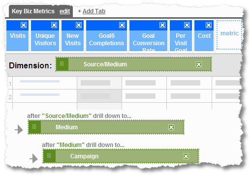
You'll note that I have pre-built two drill downs into this report.

If you click on the Source/Medium you'll drill down to Medium. For your email / search / display / social media / video / whatever else campaigns you'll now see the next level of detail (banner ad or rich media ad or. . .).
If you click on Medium you'll drill down to Campaign Name (certain size, duration, destination, promo code, whatever you have coded).
So you can hold all your $$$ accountable.
If you have an Ecommerce website replace the Goal Conversion Rate metric with Conversion Rate and Per Visit Goal Value with my favorite Average Value.
As with the above report you can apply segmentation to this report (please do!) and you can also use the Comparison view and, another love of mine, Advanced Table Filtering.
Faster insights, and massive increase in hugs and kisses, guaranteed!
#3: Paid Search Performance Analysis Micro-Ecosystem!
Allow me to kvetch for a second. I pull my hair out, and a small part of my soul dies, every time I log into someone's Omniture or Google Analytics or Unica NetInsight account. For the thing that greets me is a massive data puke. Tons and tons of reports created for God knows what reason.
They are the bubonic plague of our existence.
It is as if our lives were not miserable enough with the 80 or 100 standard reports we have no idea what to do with. Now those not savvy in the first place about Visits and Visitors have to wade through even more irrelevant nonsense.
I have championed the elimination of standard reports (who the heck is "standard" anyway? you?) and instead advanced the creation of focused custom "micro-ecosystems" that 1. reduce the number of reports 2. provide a one-stop destination for most answers on one topic, and finally, most importantly, 3. are hyper relevant.
Here are the three steps to creating a self contained micro-ecosystem of relevant data:
STEP 1: Identify & understand who will consume the data.
STEP 2: You are not going to believe this. . ., talk to them (!) to understand their needs and success criteria.
STEP 3: Insert two ounces of your raw brain power. What do they need, beyond what they want?
That's it. I know it sounds simple. Trust me everything below is easy (actually I am going to give you the report for free!), the steps above are really hard.
The micro-ecosystem I have created for you is to analyze the performance of a Paid Search Marketing program. The above examples have been non-ecommerce; this one is focused on ecommerce.
There are three key parties I need to satisfy (as might be the case in your company). The SEM team, who actually spend all the paid search marketing budget day-to-day. The second party is the person who owns the website (Director). Finally the VP of Digital who is responsible for all the spend, across multiple efforts.
Following my three step process above I have noted what each party wants, and, this is important, I have, from my experience, identified what they need.
Here is the micro-ecosystem. . . piece number one. . .
Everyone in the company goes to just one report to analyze the performance of the paid search campaigns. When they log in they choose their relevant tab. It's that simple.
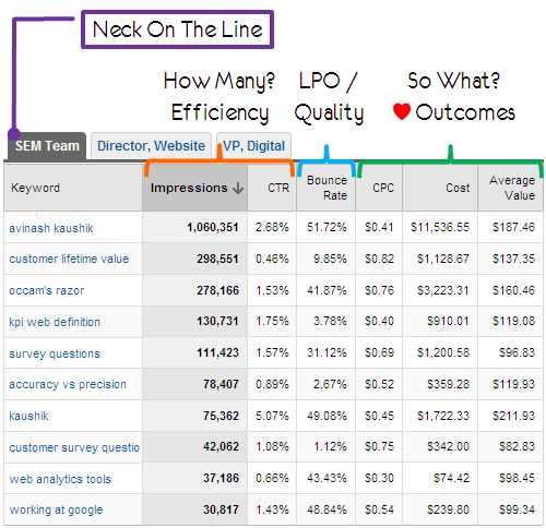
The first tab is focused on the SEM team. Four metrics on this page are what they directly asked for, things they watch every day, things their bonus depends on. I have added two more from my experience to prompt good behavior (Bounce Rate) and tie them to the bottom-line (Average Value).
First, we look at the "input." How many ad impressions were served? How did our ad perform in terms of Click-thru Rate? The team obsesses about this. Match types. Ad Copy. Quality Score. Ad Position. Campaign Structure. Search query. So many things in play, this is where you find out where to start looking for problems.
Second, we look at activity. It is exceedingly rare that the SEM team (or, even worse, the Search Agency) is responsible for Bounce Rate. I think this is criminal. They can't just be responsible for spending money and dumping traffic on the site. However painful, they have to work with the site owner to ensure landing page relevancy, ad message consistency from Bing/Google to website and quality of their ad targeting. This humble metric is to force them to do that.
Third, I am sure you see a theme in all my work, outcomes! The team cares about Cost Per Click and total Cost. Give 'em that. But you'll be shocked that most of the time they don't care about conversions. So I add Average Value (essentially Average Order Size) so they can see which keywords to focus on more or less (see the range above from 82 to 211!) and not just clickthru rate, etc.
The SEM team / Agency will do lots of other reporting and segmentation and deep dive analysis. But they now have a simple and effective starting point.
Next up. . . the person who owns the process after the traffic shows up. This might be different in each company, but typically the website is owned by one person. Here is their tab. . . on the exact same report!

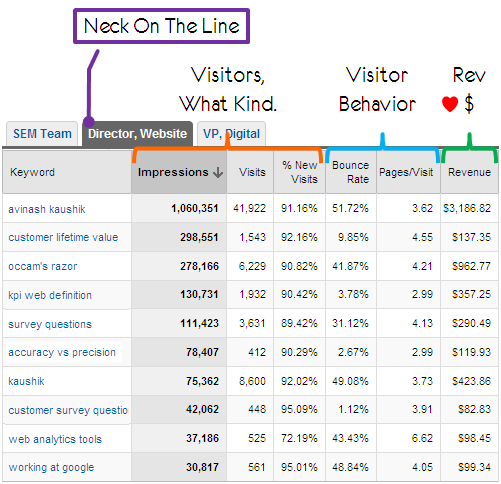
We shift our focus quite a bit as we move to the Director / Site Owner. They don't care about all the upfront stuff. They care about what's happening under their responsibility.
First, we focus on how many Visits occurred and what kind of Visitors they were? Specifically are we attracting just the same old visitors we have always seen or is our money being spent optimally to attract new people to our site? Percentage of New Visits is here as a conversation starter between the Director & the SEM Team / Agency.
Second, what's happening on the website? Are the entry home pages great? Bounce rate is a joint responsibility. Then it is important to realize that sadly not everyone will convert (boo!). I have chosen Pages per Visit as a proxy for an activity of value completed by the Visitor to the site. We know what the Average Pageview per Visit is; this column tells us if by keyword the difference, and if people don't bounce do they connect with our content? If not then why not? As a Director that is my job to figure out.
Third, surely my neck is on the line for ensuring that money (lots of it) is being produced. Hence the Revenue column. It takes less than ten seconds of eyeballing to figure out where there is a mismatch between crowds of visits and a mass of revenue (or not), and between non-bounce content consumption and revenue production.
Sweetness. One report. We are all on the same page!
The SEM team is probably logging into the system all day long; the Director perhaps a few times a week; the VP of Digital probably just a few times a month. But when She/He does they'll go to the exact same report and click on Her/His tab.
Here's what they'll see. . .

[Note: Here are things good Analysis Ninja's worry about. You'll notice Impressions in all three personalized tabs. The Director and VP don't really care about this metric. It is there as an "anchor." Whichever tab you go to the data will always be sorted the same! Tiny detail, but it matters so much.]
The VP is greeted with a lot fewer metrics (remember: always fewer relevant metrics!).
First, they might pay a cursory glance at the summary view provided in the scorecard(which will be on top of the above report but I have cropped for clarity). They do care about traffic. Just seeing the sorting of the Visits, in context of the Impressions, will give them pause. Note the questions that might pop up, even to a VP, as you compare the queries "accuracy vs. precision" and "kaushik". Or "customer service questions." What is up with that?
Second, VPs care about cost and they care about productivity. These are two columns they use to praise you and get you and themselves a bonus. What is the Cost per Click and, for that expense, what is the Revenue per Click? I don't have to tell you what to do with these two columns. Love them a lot.
Third, VPs care about their bonus. Sorry, I mean they care about company revenue. :) Knowing RPC is important, having Revenue right there is fantastic context about overall achievement. You could have stuffed number of transactions or orders or conversion rate or all that other junk. You don't need to. Remember: fewer relevant metrics!
Your effort into the three STEP process above pays off rich dividends by killing data pukes, focusing on what's important, and creating one destination for everyone to go to and for everyone to point to.
It is so amazing when this works.
Here's how you can get this report:
- Log into Google Analytics.
- Come back here.
- Now click on this link Paid Search Analysis Micro-Ecosystem. It will open in GA.
- Click on the Create Report button and it will save it in your account.
If you want to share this report with others (say via Twitter / email) you can use this url: http://zqi.me/aksearcheco
Bonus Items:
If you click on the Keyword you'll drill down to Campaign. This is important because your campaign structure has so much influence on your ultimate performance. If you click on Campaign you'll drill down to Ad Group level (which needs constant love and caring).
You can easily create a micro ecosystem for your Email campaigns. For your Social Media efforts. For your. . . any place your company is spending money.
This report is for Ecommerce. It will work just fine if you're a non-profit or a government entity using AdWords or adCenter. Just swap the outcome metrics with ones mentioned in the first two reports.
You can do segmentation, advanced table filtering and all other good stuff here. Do it.
Extra Special Bonus Items:
Except for the last report, you can create all the above reports in five minutes in any web analytics tool you are using. You will not need to touch the JavaScript tag or go on a date with the IT team or update the contract with your Paid Vendor. If you are using Omniture or CoreMetrics etc you can still create the third report in Excel. Please do.
If you are using Google Analytics check out the delightful quick start guide to Custom Reporting. It covers designing, building and viewing a custom report. Tip: Check out the super useful graphic under Building Your Custom Report.
You will fail at all the above reports if you have not identified your Goals and Goal Values. If you are starting from scratch use the Web Analytics Measurement Model to identify your Goals. If you need more tactical examples from different types of websites please refer to my blog post on Macro & Micro Conversions.
Gentle reminder: No Goals, No Glory.
I had a lot of fun creating these special reports for you. I hope you'll have just as much fun adapting them to your own companies and their unique needs. But most of all I hope you'll release your data customers from the tyranny of data pukes and irrelevant standard web analytics reports!
Ok it's your turn now.
Do you have a favorite custom report? Care to share a downloadable version with the super smart audience of Occam's Razor? Do you have some version of one of my reports above that is even better? Care to share that one?
Incentive: The person who shares the best report will get a personalized signed copy ofWeb Analytics 2.0! Please share the report via comments, I know we all would love to benefit from your wisdom and experience.
There were some wonderful reports submitted, please see the comments, but the one I loved the most was by Peter van Klinken [comment #41]. It was a very clever report and the use of pivot tables in GA was particularly cool. I'll be sending Peter a signed copy of W A 2.0.
Thanks to all of you for the wonderful submissions.
3 Awesome, Downloadable, Custom Web Analytics Reports


 Web teams are really busy handling the onslaught of daily tasks — launching new paid search campaigns, managing site updates, planning the next site redesign, creating new online surveys, building
  One of the most important steps is to involve all of the key stakeholders in the discovery of the organization’s business requirements and clarification of the online strategy. Sometimes a single person or group may feel they can represent the needs of the entire company to save time, and not all of the stakeholders need to be bothered with the discovery process. Despite the best of intentions of these individuals, I’ve seen this approach fail on multiple occasions.
  In a world where we are overwhelmed with data and metrics and key performance indicators and reports and dashboards and. . . sometimes all it takes to make some sense of all this "mess" is someone stepping up to share a tiny slice of wisdom from their experience.

